In 1970, John Pasche designed a logo for the Rolling Stones. He was paid £50. Almost 30 years later, the V&A bought Pasche’s original artwork at auction for $92,500.
![]()
He met with Jagger again where the singer “talked about things he liked and things he didn’t like, nothing too specific,” explains Pasche, “and then I just had 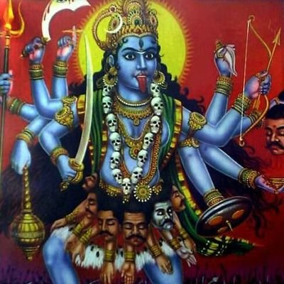 this idea.” While an obvious reference to Jagger’s features (not especially flattering, but Jagger didn’t seem to mind), Pasche says that the main reason that the thick red lips and sticking out tongue seemed so right was because it was blatantly anti-authoritarian and “they were still the bad boys of rock and roll at the time”. The tongue logo design was also inspired by the Indian Hindu goddess Kali The Destroyer.
The style came out of Pasche’s fascination with Pop Art – its directness and simplicity, he says, “is probably why it stood the test of time”.